Find designers
Designer search
Quickly find your next designer
Post a job
The #1 job board for design talent
Inspiration
Courses
UX Diploma
Learn UX design from scratch in 6 months
UI Certificate
12-week UI skill building for designers
Live interactive workshops
with design professionals
Jobs
Go Pro
Log in
Dribbble: the community for graphic design
Log in
Sign up
Nets
Fraser Davidson
Available for work
Follow
Following
Like
Get in touch
#AFAFB0
#D0D0D0
#2B2A2A
#807F7F
#403F40
Download color palette
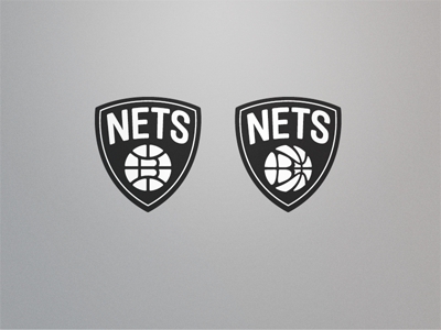
Couple of quick ideas for incorporating a 'B' in a more interesting way...
brooklyn
nets
View all tags
Posted on Apr 29, 2012
4,969
6
150
34
View feedback
Fraser Davidson
Designer & Animator
Get in touch
More by Fraser Davidson
View profile
Previous
Next
Loading…
Loading…
Loading…