Find designers
Designer search
Quickly find your next designer
Post a job
The #1 job board for design talent
Inspiration
Courses
UX Diploma
Learn UX design from scratch in 6 months
UI Certificate
12-week UI skill building for designers
Live interactive workshops
with design professionals
Jobs
Go Pro
Log in
Dribbble: the community for graphic design
Log in
Sign up
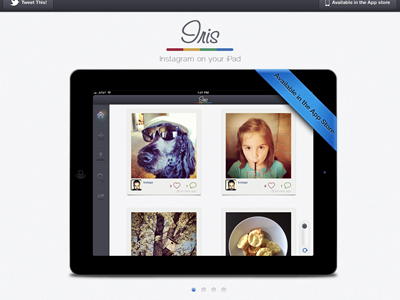
Iris App For iPad's New Site
Eric Hoffman
Available for work
Follow
Following
Like
Get in touch
#F4F4F5
#0A090B
#463742
#B5AFA2
#4881BD
#B69669
#9A6448
Download color palette
Update to the app!
Update to the site!
instagram
ios
ipad
iris
website
View all tags
Posted on Apr 28, 2012
6,932
11
177
19
View feedback
Eric Hoffman
Founder Reform Collective, Over 13 years of experience
Get in touch
More by Eric Hoffman
View profile
Previous
Next
Loading…
Loading…
Loading…