Find designers
Designer search
Quickly find your next designer
Post a job
The #1 job board for design talent
Inspiration
Courses
UX Diploma
Learn UX design from scratch in 6 months
UI Certificate
12-week UI skill building for designers
Live interactive workshops
with design professionals
Jobs
Go Pro
Log in
Dribbble: the community for graphic design
Log in
Sign up
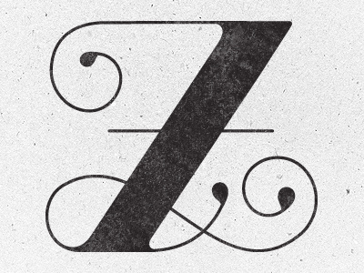
Z
Anna Ropalo
Available for work
Follow
Following
Like
Get in touch
#ECECEC
#322E2F
#535051
#C1BFC0
#A3A2A2
#817E7F
Download color palette
Purposely printed on bad paper with a bad printer...hurrah for strangely interesting textures.
lettering
typography
View all tags
Posted on Apr 27, 2012
3,690
18
236
25
View feedback
Anna Ropalo
Get in touch
More by Anna Ropalo
View profile
Previous
Next
Loading…
Loading…