Drag, Drop, Share - Waiting

Dropshare-waiting

16 Responses

  1. Adam Whitcroft Adam Whitcroft

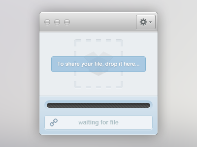
    A simple way to upload and share a file. Simply hook it into your cloud service, then whenever you want to share a file all you need do is drag and drop it into the outlined area. Once the file has been uploaded to your cloud, a short URL will be created.

    This is the 'waiting' stage - more to come soon.

    about 1 year ago

  2. Pro Jan Losert Jan Losert

    sexy!

    likes

    about 1 year ago

  3. Pro Warwick Kay Warwick Kay

    Does the 'waiting for file' and progress bar have to be displayed? I'd say hide them until something is uploaded.

    Love the design though, very nice!

    likes

    about 1 year ago

  4. Pro Joshua Hibbert Joshua Hibbert

    Love it Ad, nice work! How would it look if the 'drop' area took up all available space instead of just a square in the middle?

    The way the loading bar has been inset gives a strange optical effect of being misaligned vertically :(

    EDIT: Oh, and what is up with that 'w' that is a pixel too short?!

    likes

    about 1 year ago

  5. Ari Ari

    Your quality of work has really gotten better, keep it up!

    likes

    about 1 year ago

  6. Pro Matthew Kosloski Matthew Kosloski

    I would soo use this to share files!

    likes

    about 1 year ago

  7. Pro Daryl Ginn Daryl Ginn

    Good work, however something like this would be much more suited in a web environment as a modal. It's quite counter intuitive if you were to compare it to the likes of the cloud app.

    The cloud app has hotkeys for uploading (raindrops) also a drag and drop to dock or status bar icon, so having an extra window.. you can see my point.

    However, it doesn't take away from the fact that it's nice to look at, @Warwick Kay also made a nice point.

    Glad to see you're joining the UI dark side. Keep it up! Just remember to strive to do one better when putting ideas to canvas.

    likes

    about 1 year ago

  8. Adam Whitcroft Adam Whitcroft

    @Joshua Hibbert Thanks man! The upload progress has equal top and bottom spacing but maybe the inset is a little too subtle toward the bottom of the gradient...

    @Daryl Ginn Thanks as always for the input dude. I can definitely see where you are coming from, however I would love to have a small desktop client which is why I mocked this up (I've been basing my ideas on something I would use in my day-to-day). That's not to say it might be the best solution, but it's a tool I would love to have.

    about 1 year ago

  9. Dan Carlberg Dan Carlberg

    Look great! Would like some more contrast on the "To share your file..." box/text. It's a bit hard to read.

    likes

    about 1 year ago

  10. Pro Thorsten Beeck Thorsten Beeck

    Once again nice work Adam! Looks pretty clean and simple. I agree with @Joshua Hibbert on the "w", it looks a bit cropped compared to the other letters. And I support his suggestion regarding the "drop" area.

    likes

    about 1 year ago

  11. Louis Bullock Louis Bullock

    I can totally see this in a window like those 'drag the application's icon to the Applications folder' windows in OS X. :D

    likes

    about 1 year ago

  12. Adam Whitcroft Adam Whitcroft

    @Dan Carlberg Thanks Dan and you're spot on about the text, will increase the contrast in the rebound I hope to post later today which takes the suggestions from @Joshua Hibbert and @Thorsten Beeck's in to account.

    @Louis Bullock Hah thanks man :D

    about 1 year ago

  13. Louis Bullock Louis Bullock

    @Adam I have a suggestion...could this be simplified further?

    You could ditch all the bits of text, bars, gradients etc and just stick with the dotted round rect with the a '+' in the middle, like:

    http://f.cl.ly/items/212g3B2v2X192c1O3D1z/dropshare-waiting-v2.jpg

    Just and idea s'all.

    about 1 year ago

  14. Adam Whitcroft Adam Whitcroft

    @Louis Bullock Thanks for the suggestion but I'm going to stick with the style I've got going on (I quite like gradients). The shot I'm working on to post later is dramatically simpler than the original. Hold tight!

    about 1 year ago

  15. Louis Bullock Louis Bullock

    @Adam EZ.

    about 1 year ago

  16. Another approach to the idea. A much simpler interface with a larger drop area. If you're interested in the cardboard box let me know and I'll post it up.

    about 1 year ago

keyboard shortcuts: previous shot next shot L or F like