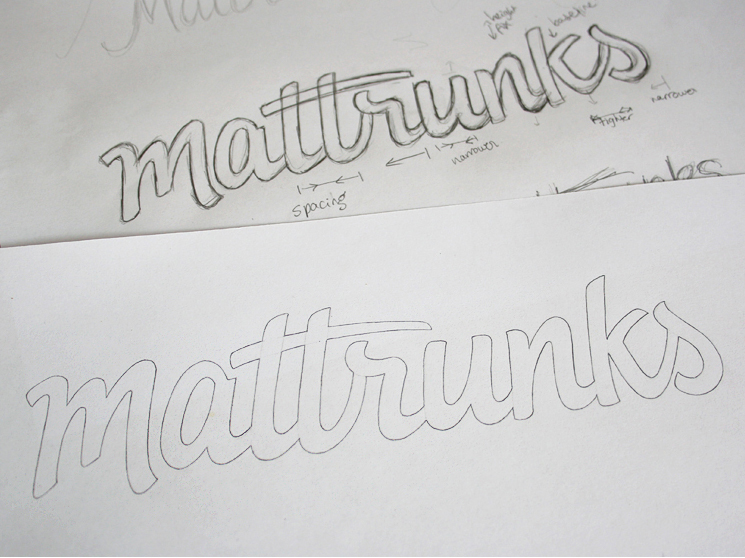
Mattrunks sketch

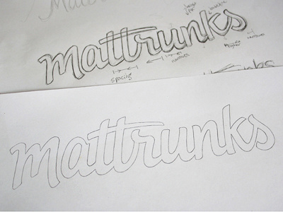
Working on a logo re-design for a website centered around motion design tutorials. It needed to be dynamic, friendly and inviting while also inspiring confidence and professionalism. I initially did some really quick drafts with a wide Copic marker to get the rough shapes and then drew over in pencil. Sketch is approved and I've just started vectoring, so feel free to point out any potential issues (I'll probably need to enlarge that small gap between the initial 's' stroke and its final curve).


