Find designers
Designer search
Quickly find your next designer
Post a job
The #1 job board for design talent
Inspiration
Courses
UX Diploma
Learn UX design from scratch in 6 months
UI Certificate
12-week UI skill building for designers
Live interactive workshops
with design professionals
Jobs
Go Pro
Log in
Dribbble: the community for graphic design
Log in
Sign up
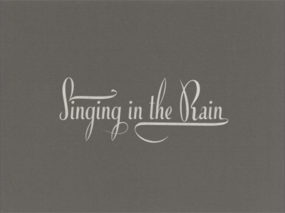
Singing In The Rain ...
Arno Kathollnig
Follow
Following
Like
#65625D
#A5A19C
#D0CDC8
#C1BEB8
Download color palette
... just playin’ with type!
fancy lettering
lettering
type
typeface
typo
typography
View all tags
Posted on Apr 25, 2012
2,110
10
89
23
View feedback
Arno Kathollnig
More by Arno Kathollnig
View profile
Previous
Next
Loading…