Stay Close To Me Babe!

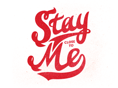
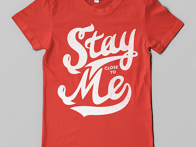

Made this yesterday for my buddy Neil the "Masta" Tasker. Well, I made the "stay" for him. I was bored and I love to make new and custom type. I thought I give this to him to see if he could use it, rather have it saved on my computer.