Homepage - Iteration 3.4


After sketching out idea 1 in Figma we sat down and fairly quickly tore it apart. While it solved the issues we highlighted in our own brief we felt it still didn't do justice to the marquee item our business revolves around and that's the knives themselves.
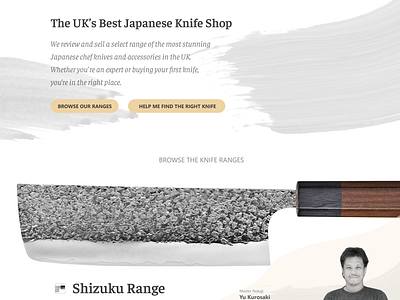
The grid was functional but perhaps didn't highlight just how beautiful the knives are so here's the next iteration.
The thinking behind this (see the full pixel attachment) was to feature a single knife from each range as big as possible and allow the user to scroll through and see the beauty right up front and then explore further if they want. This is the opposite of trying to display every knife in every range and because we're also building better search and filtering in this redesign we felt it was OK to allow for this approach.
This version also allows us to feature the blacksmith who makes each range with a mini-profile too because these guys are true artists with decades of experience and in some cases come from several generations of blacksmiths.
Ultimately this homepage would display somewhere around 15-20 ranges in this format.
✋ Press "L" to appreciate it or let me know your comments on how I could improve the experience.


