Find designers
Designer search
Quickly find your next designer
Post a job
The #1 job board for design talent
Inspiration
Courses
UX Diploma
Learn UX design from scratch in 6 months
UI Certificate
12-week UI skill building for designers
Live interactive workshops
with design professionals
Jobs
Go Pro
Log in
Dribbble: the community for graphic design
Advance your career with a Professional Diploma in UX Design
Learn more
Log in
Sign up
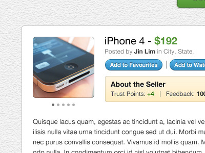
iPhone 4 - $192
James
Available for work
Follow
Following
Like
Get in touch
#F8F6F4
#B9B3AC
#5299C4
#343B40
#457295
#5A5C5F
#9E6758
#83964F
Download color palette
Working on some inner pages of a big project I've been working on for a couple of months now.
blue
buttons
green
image slider
interface
qpop
View all tags
Posted on Sep 7, 2010
3,423
2
29
6
View feedback
James
Designer at Wireframe Design Studio
Get in touch
More by James
View profile
Previous
Next
Loading…
Loading…
Loading…