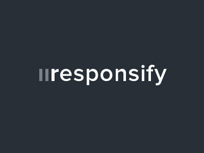
Responsify Branding
Been re-thinking the branding for Responsify a little. I'm very happy with how it is currently, but a few people have pointed out that initially they read it as iiresponsify, which obviously would send a completely different message. So I lowered the opacity of the two columns beside the r which gives them a lot less emphasis now, what do you think of this direction?
You can see the original here: http://d.pr/i/445v
Oh and I pushed Responsify live, so please go check it out and let me know what you think!
More by Stuart Kennedy View profile
Like


