Mixio landing page

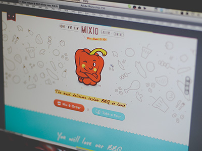

I had a chance to help my friend's business which focus on custom BBQ while also provide other foods and beverages. I'm in charge designing the landing page and order page.
It should be fun. The colors are a derivation from the main color used for the brand. It's one page site. Any feedback and critiques are welcomed.
Note: the "Mix, Order & Eat" will come up later after with some animations.


