Mocao

1 Attachment

29 Responses (page 1 of 2)

  1. Pro Paresh Khatri ::::✈ Paresh Khatri ::::✈

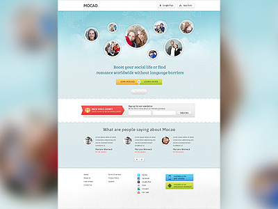
    Finally I have completed with the design hope you guys like it let me know your view :)

    P.S. I need to work on footer a bit because its quit looking so simple :) let me know if you guys have any nice idea

    about 1 year ago

  2. Pro Tanveer Junayed  Tanveer Junayed 

    @Paresh Khatri :: Great clean layout mate. Love it

    likes

    about 1 year ago

  3. Pro Max Litvin Max Litvin

    Superb :)

    likes

    about 1 year ago

  4. Pro Brian Lovin Brian Lovin

    For the footer, maybe just add some of that subtle 'pixelated-earth' texture/image from the background of the main section...kind of hard to explain.

    likes

    about 1 year ago

  5. Pro Paresh Khatri ::::✈ Paresh Khatri ::::✈

    @Tanveer Junayed  @Max Litvin Thanks guys
    @Brian Lovin yeah may be I need to use some patterns over there to stand out the footer a bit :)

    about 1 year ago

  6. Pro Jared MacPherson Jared MacPherson

    Looks great! Congrats man.

    likes

    about 1 year ago

  7. Mpumelelo Macu Mpumelelo Macu

    Great work. :)

    likes

    about 1 year ago

  8. Pro Lukas Bugla Lukas Bugla

    Nice :)

    about 1 year ago

  9. Pro Lewis Braid Lewis Braid

    Awesome work! /Whats the title font? Looks like Neo Sans but not sure...

    likes

    about 1 year ago

  10. Pro Paresh Khatri ::::✈ Paresh Khatri ::::✈

    @Scott Riley Thanks man I have already corrected that because I also thought the white shadow looking bit hard I have made it bit lighter :)

    about 1 year ago

  11. Pro Kean Richmond Kean Richmond

    I'm not sure if you'll reproduce the banner circle images for implementation but the way they've been created has the images look like they're not prefect circles, the edges go to a slight point.

    Otherwise it's looking good.

    about 1 year ago

  12. Pro Paresh Khatri ::::✈ Paresh Khatri ::::✈

    @Kean Richmond I dont know what happened with the circles but in PSD it just looks fine :(

    about 1 year ago

  13. Pro Avinash Tripathi Avinash Tripathi

    nice, only the messaging stuff had to be scrolled to know what it is!

    about 1 year ago

  14. Sam Burgon Sam Burgon

    Regarding your comment about the footer - there's no such thing as too simple

    about 1 year ago

  15. Pro Lewis Lewis

    Amazing, good job mate!

    likes

    about 1 year ago

  16. Grishma Rao Grishma Rao

    So lovely

    about 1 year ago

  17. Pro Ondrej Lechan Ondrej Lechan

    nice! this blurry background is lovely, you can use it in website too :)

    about 1 year ago

  18. Pro Ashish Thakkar Ashish Thakkar

    Fresh!!! Well done Paresh

    about 1 year ago

  19. Pro Francis Chouquet Francis Chouquet

    Really nice Paresh !! :P

    about 1 year ago

  20. Pro Paresh Khatri ::::✈ Paresh Khatri ::::✈

    Thanks guys :)

    about 1 year ago

  21. Andrey S. Rodrigues ☝ Andrey S. Rodrigues ☝

    really nice

    about 1 year ago

  22. Rodrigo Neri Rodrigo Neri

    Looks cool!!... Small detail... you got google play on the header and android market on the footer :)

    about 1 year ago

  23. Pro Mason Yarnell Mason Yarnell

    Very cool design, @Paresh! Well done!

    about 1 year ago

  24. Pro Maxwell Barvian Maxwell Barvian

    This is incredibly well done, but I actually liked it more before I realized I was zoomed out :P (the image was around 1170px wide).

    about 1 year ago

  25. Pro Eddie Lobanovskiy Eddie Lobanovskiy

    looks awesome mate! :)

    likes

    about 1 year ago

keyboard shortcuts: previous shot next shot L or F like