Find designers
Designer search
Quickly find your next designer
Post a job
The #1 job board for design talent
Inspiration
Courses
UX Diploma
Learn UX design from scratch in 6 months
UI Certificate
12-week UI skill building for designers
Live interactive workshops
with design professionals
Jobs
Go Pro
Log in
Dribbble: the community for graphic design
Advance your career with a Professional Diploma in UX Design
Learn more
Log in
Sign up
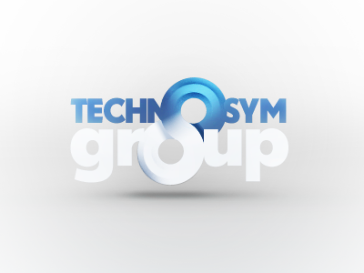
Logo Design - Technosym Group
UI8
Available for work
Follow
Following
Like
Get in touch
#EDEDEE
#AAABAC
#A2BDD6
#4874AF
#55A7D6
#5A9AD0
#3565A5
#1D4279
Download color palette
This is the rejected version, thought it was worth a shot.
artists
best
branding
design
designers
developers
graphic
graphic design
illustration
illustrators
logo
logo designers
web
View all tags
Posted on Apr 22, 2012
5,602
6
60
4
View feedback
UI8
Design studio / Resources for designers.
Get in touch
More by UI8
View profile
Previous
Next
Loading…
Loading…
Loading…