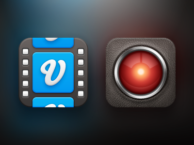
Rejected icon concepts for a video sharing app I am working on.
Don't blame the client for rejecting these; it's just part of the process :)
Will post a rebound soon.