Apple Watch Face UI fix - GIF


Hi, Dribbblers.
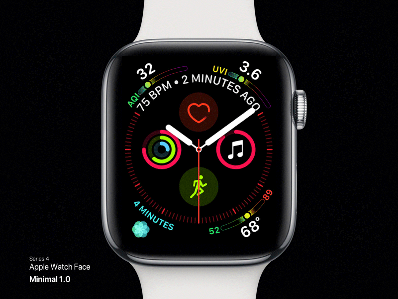
Apple introduced Watch Series 4, large display with redesigned UI but I have a problem with watch face.
Well that filled gradient bar catching so much attention. I don't want to see that many colours. I believe it should be minimal and data should get highlight more with subtle touch of colour gradient.
1) Minimal 1.0 is outline gradient which has 30% opacity and some shades of gradient around the circle for some depth and attention.
2) Minimal 2.0 is same as previous except the ends are transparent. Create depth and highlight the circle with prominent data.
Let me know what you guys think.
Image credit : Apple.
UI/UX Interaction Collections
Vol 1.0
Micro-interaction Collections
Vol 1.0


