Personal JW Logo (animated)

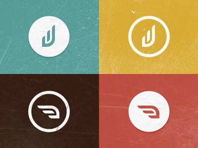
This is a personal logo that I've been working on for quite a while. It's supposed to be a 'J' & 'W', and when rotated it's a wing to represent my last name. I'm trying to decide if I want the icon to be in the 'JW' position or the wing position. Any feedback is greatly appreciated.


