Ribbon navigation

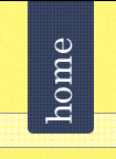
This is a small snippet of something that just got approved by the client. I feel like the ribbon/tab bit could use a bit more depth but just adding a regular drop shadow looks tacky, so I'd appreciate any input. Making full use of Naomi Atkinson's pixel patterns as you might notice :)
Also wondering if the text could use something extra as well.


