Find designers
Designer search
Quickly find your next designer
Post a job
The #1 job board for design talent
Inspiration
Courses
UX Diploma
Learn UX design from scratch in 6 months
UI Certificate
12-week UI skill building for designers
Live interactive workshops
with design professionals
Jobs
Go Pro
Log in
Dribbble: the community for graphic design
Advance your career with a Professional Diploma in UX Design
Learn more
Log in
Sign up
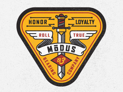
Hat Patch
Kendrick Kidd
Available for work
Follow
Following
Like
Get in touch
#F1F1F1
#F8B423
#2C292A
#AC4630
#5B534B
#A7A2A2
#7E7E81
Download color palette
not sure about the honor & loyalty part... any suggestions?
badge
patch
View all tags
Posted on Apr 19, 2012
8,319
70
393
26
View feedback
Kendrick Kidd
Design, illustration and sunshine.
Get in touch
More by Kendrick Kidd
View profile
Previous
Next
Loading…
Loading…
Loading…