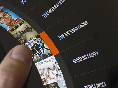
I really like this, but the roulette was so cool and it would be extremely easy to navigate with a thumb just by swiping up and down and then you could have extended information for each show appear on the left. Maybe you could convince the developers to code the roulette :)
This time, I worked on little boxes that you press.
Keeping the clean aspect of the previous version, but having bigger images makes the grid feel like it's got more content.
Shows that have new items will show the name in Blue
23 Responses
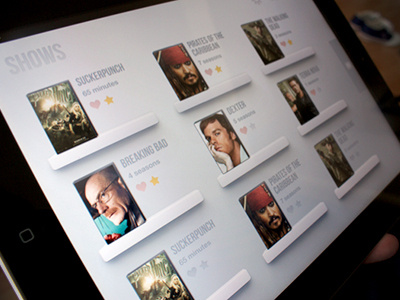
A new, more classic interface to replace the Roulette Menu.
I know I know, those are not shows but movies, I was just lazy finding pictures for the shows LOL
Do you guys like this better? I'll change the icons for the shows, I'm still working on it
EDIT: I'll try and upload the full version mock-up when it's ready :D
about 1 year ago
Este está bien, pero me gusta más el otro :)
about 1 year ago
@Fran Pérez yo creo que a este le falta un poco de fuerza no?, los iconos los quiero quitar de en medio
about 1 year ago
Pro
Maxwell Barvian
̶I̶ ̶l̶i̶k̶e̶ ̶i̶t̶ ̶a̶ ̶L̶O̶T̶ I seriously love this. Looks very soft and super clean!
about 1 year ago
thanks @Maxwell Barvian! I'll try and upload the full version mock-up when it's ready :D
about 1 year ago
looks very cool! i guess i have to work harder on my tv shows app desing, this is really cool. Good job!
as @Maxwell Barvian say, look soft and super clean.
about 1 year ago
@Carlos Mas Salom I didn't know you were working on something similar, your app looks REALLY good to bro!
it's gonna be a though competition :)
about 1 year ago
competition is always good, make us improve... otherways we stuck. for me is a good thing ;)
about 1 year ago
Me wantzz. :D
about 1 year ago
Super clean!
btw, fy Breaking Bad :P
about 1 year ago
Pro
Ashish Thakkar
Loving it :)
about 1 year ago
@Jack Bach breaking bad HAS to be there :D
@Ashish Thakkar thank you man!
about 1 year ago
Pro
Mike Precious
Love the open, breathable, spacial properties. Tastefully modern and approachable design. Good work!
about 1 year ago
thankyou very much @Mike Precious , this means a lot to me coming from you.
about 1 year ago
I really like this, but the roulette was so cool and it would be extremely easy to navigate with a thumb just by swiping up and down and then you could have extended information for each show appear on the left. Maybe you could convince the developers to code the roulette :)
about 1 year ago
Nice work! Love it
about 1 year ago
Pro
Tanveer Junayed
This is very nice @Miguel.
about 1 year ago
@Oleg Estrin That's exactly how I thought the navigation.
I'll show 'em these comments and see if I can convince them :D
@Shad Romero and @Tanveer Junayed Thank you very much guys!
about 1 year ago
I really liked! :)
about 1 year ago
i really like the layout :)
about 1 year ago
Rebound
Tv Shows app - New layout
by Miguel Oliva Márquez
Hey guys, i just changed the layout here.
This time, I worked on little boxes that you press.
Keeping the clean aspect of the previous version, but having bigger images makes the grid feel like it's got more content.
Shows that have new items will show the name in Blue
Photo by @enriquealex
Check full size :)
about 1 year ago
clear design, looks very cool!
10 months ago
@Gio Soseba thanks man! :)
10 months ago