Find designers
Designer search
Quickly find your next designer
Post a job
The #1 job board for design talent
Inspiration
Courses
UX Diploma
Learn UX design from scratch in 6 months
UI Certificate
12-week UI skill building for designers
Live interactive workshops
with design professionals
Jobs
Go Pro
Log in
Dribbble: the community for graphic design
Advance your career with a Professional Diploma in UX Design
Learn more
Log in
Sign up
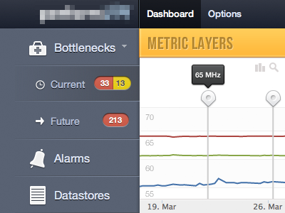
Metric Dashboard
Ryan Bales
Available for work
Follow
Following
Like
Get in touch
#F9F9F9
#576070
#1F232E
#F0BC4B
#607394
#AEB1B4
#A16F69
Download color palette
Dashboard to show different performance metrics. Icons from iconSweets
app
chart
dashboard
data
graph
ui
webapp
View all tags
Posted on Apr 16, 2012
10,069
25
145
15
View feedback
Ryan Bales
Beautiful & Functional Web & Mobile Apps
Get in touch
More by Ryan Bales
View profile
Previous
Next
Loading…
Loading…