Really great, although I do see what @Jon Vlasach is talking about with the v-alignment. Great choice on the font though, and the colors are spectacular.
Awesome subtle typography and colours. It looks like the word 'Resumes' is placed just a couple a pixels to high. Could be wrong though... Looking forward to seeing this finished!
33 Responses (page 1 of 2)
Pro
Julien Renvoye
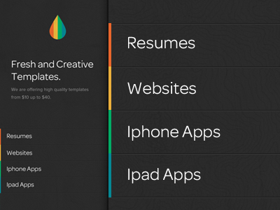
I always wanted to launch a website where I could offer fresh designs for iPhones, websites, iPads, resumes, ... I would offer PSD or HTML5 files.
This is a design I did few weeks ago and might finish soon. This could be a one night project!
-----
Follow me on twitter if you want to stay in touch with the progress of this app!
about 1 year ago
Pro
Tim Smith
Everything you make is just so polished and gorgeous. Great work.
about 1 year ago
Pro
Konrad Księżopolski
nice nice ! :) great work!
about 1 year ago
Pro
Jon Vlasach
looks great, maybe double check vertical alignments of the links in the panels :)
about 1 year ago
Pro
Matt Johnston
Beautiful work.
about 1 year ago
Pro
Joel Reid
Very nice. I want to go to there.
about 1 year ago
Pro
Alex Pankratov
Looks lively. Perhaps fix capitalization of iPhone and iPad though?
about 1 year ago
Pro
Jeffrey Jorgensen
Really great, although I do see what @Jon Vlasach is talking about with the v-alignment. Great choice on the font though, and the colors are spectacular.
about 1 year ago
Pro
Julien Renvoye
Thanks guys! You are definitely pushing me now to finish it asap :)
@Jon Vlasach & @Jeffrey Jorgensen: Totally guys. It will be fix :)
about 1 year ago
Pro
Ced Funches
very nice
about 1 year ago
Pro
Clayton Correia
This is really nice, love the colour choice on the nav/logo.
about 1 year ago
really nice, as usual Julien.
about 1 year ago
Pro
Matthew Sanders
Haven't seen this style in a while. Nice take on it.
about 1 year ago
Pro
Ahmed Naxeem
nice texture
about 1 year ago
very cool! excited to see the site :)
about 1 year ago
Pro
Jakub Linowski
Good stuff.
about 1 year ago
*iPhone
*iPad
about 1 year ago
Very clean. Awesome job!
about 1 year ago
Pro
Joshua Sortino
Love it, but I agree with everyone on the iPhone/iPad capitalization.
about 1 year ago
Pro
Trent McBride
Marvelous! Love it!
about 1 year ago
Pro
Moises Oswaldo Urrutia
That is slick! Love it! Did you make the texture for the gray menu area or did you get it somewhere?
about 1 year ago
Pro
Mani
clean!
about 1 year ago
Love the soft colors !
about 1 year ago
Awesome subtle typography and colours. It looks like the word 'Resumes' is placed just a couple a pixels to high. Could be wrong though... Looking forward to seeing this finished!
about 1 year ago
Crisp & fancy.. but maybe I would align the text of the menu-items with the headline "Fresh & creative templates"?
about 1 year ago