Nav is a little close. I would say even more than a few pixels. Not sure if they have a transparency but they look like they are adopting the texture behind them (I don't have my glasses on)
the gray to dark gray to orange is easier but not sure about the gray one.
@Nick Slogget Working on unifying the textures and theme across the site. Definitely coming together easily and looking a lot sharper. Spaced the nav options out a tad since posting this. Thanks again! I'll probably have a revised version emailed to you tomorrow.
8 Responses
Pro
Timothy Whalin
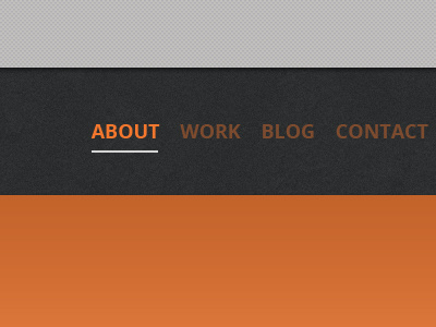
A lot of refining of my personal site thanks to some great feedback from @Nick Slogget. Here's another peek at what's coming.
about 1 year ago
Very nice! I'd increase the spacing (by a few pixels) between navigation items.
about 1 year ago
Pro
Timothy Whalin
@Matthew Mascioni Definitely. Thanks for the suggestion! :)
about 1 year ago
Pro
Nick Sloggett
Hmmm I see changes!
Nav is a little close. I would say even more than a few pixels. Not sure if they have a transparency but they look like they are adopting the texture behind them (I don't have my glasses on)
the gray to dark gray to orange is easier but not sure about the gray one.
about 1 year ago
Pro
Timothy Whalin
@Nick Slogget Working on unifying the textures and theme across the site. Definitely coming together easily and looking a lot sharper. Spaced the nav options out a tad since posting this. Thanks again! I'll probably have a revised version emailed to you tomorrow.
about 1 year ago
Pro
Nick Sloggett
Baller ill be in SF so the earlier the better so I can spend some time checking out the mastermindness
about 1 year ago
Pro
Avinash Tripathi
nice!
about 1 year ago
Pro
Cliff Huizenga
Loving the orange and dark gray. Very nicely done so far!
about 1 year ago