Wear It All Day

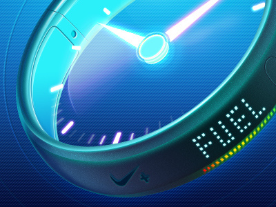

Hi Guys, here is another icon for famous sports wear company. This one is from the same collection as 2 last ones. The task was to design some modern looking watch.
Do you like it?
Hi Guys, here is another icon for famous sports wear company. This one is from the same collection as 2 last ones. The task was to design some modern looking watch.
Do you like it?


