Twitter

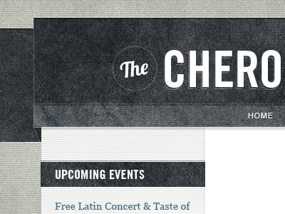
Cherokee Street News

Shot_1283382238

16 Responses

  1. Me Dan Higbie

    Well hello gorgeous! This is pretty, I love all the grey, or gray. :)

    over 1 year ago

  2. Photo Craig Ruks

    Nice job! Really like how you keep the base texture of horizontal lines consistent through multiple elements.

    over 1 year ago

  3. Pro Twitter Christopher Meeks

    Thanks guys!

    Cherokee Street is a famous and awesome street in St. Louis. I'm trying to see if I can integrate a Cherokee Native American (this street uses images of them liberally) without coming across as insensitive.

    likes

    over 1 year ago

  4. Pro 8b9a51469f4346eea29df2137a86b8c3_7 Davy Rudolph

    Can I eat it? Dang.

    likes

    over 1 year ago

  5. Pro Patrick Pat Dryburgh

    The texture is a little much for me, but that could be a lack of context. The type is lovely, as usual with your work.

    The one thing that seems to be throwing me off is the depth perception. It appears as though the header is a banner that pops off the page. The content section appears to be flush with the overall background layer, but the banner doesn't pop off the content section as much as it would appear it should… I'm really not doing a very good job explaining this. Does anyone else see that?

    over 1 year ago

  6. Pro Twitter Christopher Meeks

    @Pat

    The texture is certainly thicker than I would use for some designs, but I feel like it is appropriate for this project. The client wants something that fits with the style of the newer/hipper stores in the area. Two of those stores are coffee shops that have heavily textured logos on old antique wood and the other is an amazing press and designer whose known for his textured/layers. Cherokee Street is also known for their "Antique Row" of shops, etc.

    On the depth, you may be right about that. I wasn't as focused on making the depth believable as I was on making it aesthetic. I think you are assuming the main column is flush with the background simply because it doesn't have a drop shadow on it, though. I feel like it could be believably between the top of the banner and the background. No drop-shadow needed when the style is not really going for total realism.

    What do others think?

    over 1 year ago

  7. Pro Dribbbleavatar Ryan Brunsvold

    I love all the textures but I think I see what Pat is talking about and I'm not sure a drop-shadow would correct it 100%.

    I think the depth of the banner is displaying incorrect perspective. Almost as if there's another layer acting as an invisible buffer providing an edge the viewer can't perceive.

    I think if you just slightly darken the background ribbon (to increase the natural assumption of depth) and made the angle of the ribbon fold a bit less drastic the perspective will be easier to grasp.

    One other small thing... There appears to be a shadow falling between the bottom edge of the banner and the main content area. While appropriate in placement, I'm seeing it as more of a faint double-line, almost like a ghost of something that used to be there. Maybe play around with the opacity of that shadow as well.

    Can't wait to see this live as even this small shot is gorgeous. A+

    over 1 year ago

  8. Pro Joel-backyard-07-2011-med Joel Glovier

    Dude you killed it with the texture (in a good way). :-)

    over 1 year ago

  9. Dk_avator Dasha

    wow, it's awesome! like the colours and effect! great!

    over 1 year ago

  10. 215388_10150160444709242_553329241_6588207_2368744_n Malte Müller

    obviously, textures are the theme here. they work really, really well for me. i like the fact they're slightly over the top. very much looking forward to see more of it.

    over 1 year ago

  11. Pro Encrg Kevin Richardson

    Looks really great. Is the word "the" custom lettered, or is it a typeface? It looks sharp!

    over 1 year ago

  12. Pro Twitter Christopher Meeks

    It's a typeface called "Lobster". Its "Th" combination is beautiful...

    likes

    over 1 year ago

  13. Pro Face Naomi Atkinson

    Lovely stuff. I want to touch it.

    over 1 year ago

  14. Pro 100 Krystyn Heide

    I'm digging that stripey thing going on...

    over 1 year ago

  15. Pro Twitter Christopher Meeks

    Thanks Naomi & Krystyn

    For what it's worth, the site is live.

    I still have some little finishing tweaks I need to add to it, but most of the site is designed and accounted for (It is basically only one page).

    And I know there are some broken links, that's not my problem ;)

    over 1 year ago

  16. Pro Twitterdjb Dan Brindley

    Great textures.

    7 months ago

keyboard shortcuts: previous shot next shot L or F like