Enexis iPhone UI

Enexisui

1 Attachment

35 Responses (page 1 of 2)

  1. Pro Robert van Klinken Robert van Klinken

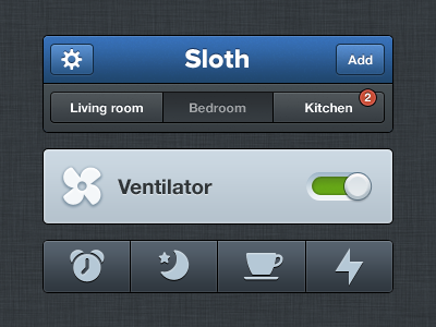
    UI shot of the Sloth app I’ve been working on. Retina file attached. Inspired by Tim to show the interface this way. And go get Geomicons

    likes

    about 1 year ago

  2. 👓  Russ 👓 Russ

    Oh my... I want to touch this app all over the place. It just looks really DAMN good.

    likes

    about 1 year ago

  3. Pro Konrad Kolasa Konrad Kolasa

    Man, crispy and awesome… as usual! =)

    likes

    about 1 year ago

  4. Pro Jack Bingham Jack Bingham

    Looks great, dude!

    about 1 year ago

  5. Pro Benjamin Brown Benjamin Brown

    lovely!

    about 1 year ago

  6. Pro Bady Bady

    @Robert van Klinken awesome man! one thing perhaps the bolt icon taking too much space (vertically)

    likes

    about 1 year ago

  7. Pro Tim de Groot Tim de Groot

    dude, you seriously make me feel bad about my own stuff. Stop doing that! ;p

    This stuff is inspiring man, again! I love the simplicity and diversity at the same time.

    likes

    about 1 year ago

  8. Pro Lukas Bugla Lukas Bugla

    Good job Sir :)

    about 1 year ago

  9. Al ☯ Power Al ☯ Power

    love it!

    about 1 year ago

  10. Pro Doney den Ouden Doney den Ouden

    So crisp!

    about 1 year ago

  11. Pro Avinash Tripathi Avinash Tripathi

    very slick!

    about 1 year ago

  12. Pro Joey Rabbitt Joey Rabbitt

    The Sony employee in me says "PlayStation" needs capitalising on your enlargment ;)

    about 1 year ago

  13. Pro Leon Bolwerk Leon Bolwerk

    Very nice Robert!

    about 1 year ago

  14. Andrey S. Rodrigues ☝ Andrey S. Rodrigues ☝

    great, I love it

    about 1 year ago

  15. Pro Gil Gil

    sweet

    about 1 year ago

  16. Pro Aurélien Foutoyet Aurélien Foutoyet

    Yesss ! that's really sharp I love these UI elements.

    about 1 year ago

  17. Jonathan Younes Jonathan Younes

    Very sharp and clean!

    about 1 year ago

  18. Pro Davey Heuser Davey Heuser

    The blue color looks really good ;)

    about 1 year ago

  19. Pro Clayton Correia Clayton Correia

    Super clean, really like this.

    about 1 year ago

  20. Gadzhi Kharkharov Gadzhi Kharkharov

    Sir, this is so beautiful.

    about 1 year ago

  21. Sebastiaan de With Sebastiaan de With

    I understand wanting to customize things, but there's a reason switches have ON / OFF labels. If you're colorblind, there's no telling what position these switches are in. I also think the tab bar is a bit strange looking -- I'd make the icons smaller and add textual labels, like the standard iOS tab bar.

    likes

    about 1 year ago

  22. Pro Enrique Sánchez Enrique Sánchez

    I want to click that on/off slider so badly!

    about 1 year ago

  23. Pro Robert van Klinken Robert van Klinken

    Wow thanks guys!

    @Sam Feyaerts @Sebastiaan de With Thanks a for the feedback guys. Never thought about that. Useful!

    I personally don't think it's necessary to add labels on apps that are going to be used daily though.

    about 1 year ago

  24. Pro Tim van Daatselaar Tim van Daatselaar

    sick.. brilliant!

    about 1 year ago

  25. Pro Jordan Flaig Jordan Flaig

    is it normal if my mouth begins to salivate and I'm become full of envy when looking at this?

    likes

    about 1 year ago

keyboard shortcuts: previous shot next shot L or F like