Find designers
Designer search
Quickly find your next designer
Post a job
The #1 job board for design talent
Inspiration
Courses
UX Diploma
Learn UX design from scratch in 6 months
UI Certificate
12-week UI skill building for designers
Live interactive workshops
with design professionals
Jobs
Go Pro
Log in
Dribbble: the community for graphic design
Log in
Sign up
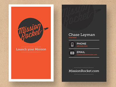
Mission Rocket Business Card
Chase Layman
Follow
Following
Like
#303030
#F15631
#D4B493
#AC9277
#E2D8CD
#817F80
#B4543D
Download color palette
business
card
orange
View all tags
Posted on Apr 12, 2012
9,376
50
176
7
View feedback
Chase Layman
More by Chase Layman
View profile
Previous
Next
Loading…