Find designers
Designer search
Quickly find your next designer
Post a job
The #1 job board for design talent
Inspiration
Courses
UX Diploma
Learn UX design from scratch in 6 months
UI Certificate
12-week UI skill building for designers
Live interactive workshops
with design professionals
Jobs
Go Pro
Log in
Dribbble: the community for graphic design
Advance your career with a Professional Diploma in UX Design
Learn more
Log in
Sign up
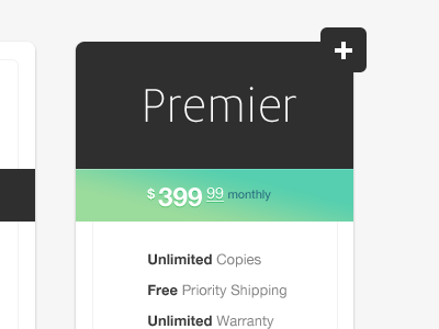
Premier price plan
Kyee
Available for work
Follow
Following
Like
Get in touch
#F9F9F9
#2F2F2F
#63D1AB
#93DA9F
#9CA4A1
#626262
Download color palette
Playing around with Price plan design mockups.
analytics
blue
data
green
grey
helvetica
milo
plan
price plan
pricing
pricing plan
web design
white
View all tags
Posted on Apr 10, 2012
89,390
249
1,179
33
View feedback
Kyee
Get in touch
More by Kyee
View profile
Previous
Next
Loading…
Loading…
Loading…