Find designers
Designer search
Quickly find your next designer
Post a job
The #1 job board for design talent
Inspiration
Courses
UX Diploma
Learn UX design from scratch in 6 months
UI Certificate
12-week UI skill building for designers
Live interactive workshops
with design professionals
Jobs
Go Pro
Log in
Dribbble: the community for graphic design
Advance your career with a Professional Diploma in UX Design
Learn more
Log in
Sign up
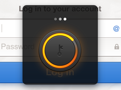
Login Page
Sixbase
Available for work
Follow
Following
Like
Get in touch
#27292B
#F0EFEF
#4C4641
#478AD9
#A8ACB2
#3372BF
#BE6627
#FCBE12
Download color palette
Working on a login page for an app.Will upload more shots soon.
button
loading
login
paper
ui
View all tags
Posted on Apr 10, 2012
60,250
56
455
17
View feedback
Sixbase
Get in touch
More by Sixbase
View profile
Previous
Next
Loading…
Loading…
Loading…