Reboon!


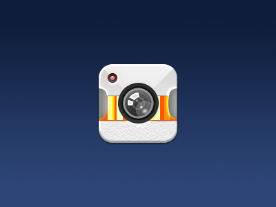
So, taking in all of your awesome advice I had another shot. It's not perfect, but it's getting there! Really agree with everyone on the simplicity. Looks much better without all the different distractions happening! Hope you like.
So, taking in all of your awesome advice I had another shot. It's not perfect, but it's getting there! Really agree with everyone on the simplicity. Looks much better without all the different distractions happening! Hope you like.


