Find designers
Designer search
Quickly find your next designer
Post a job
The #1 job board for design talent
Inspiration
Courses
UX Diploma
Learn UX design from scratch in 6 months
UI Certificate
12-week UI skill building for designers
Live interactive workshops
with design professionals
Jobs
Go Pro
Log in
Dribbble: the community for graphic design
Log in
Sign up
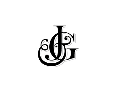
J & G monogram 3
Jamie Lawson / Poly Studio
Follow
Following
Like
#FEFEFE
#040404
#BFBFC1
#5C5C5C
#3F3F41
#9D9D9D
Download color palette
"...make it more British..."
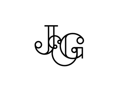
Rebound of
J & G monogram 2
By
Jamie Lawson / Poly Studio
design
identity
logo
monogram
type
typography
View all tags
Posted on Apr 8, 2012
6,777
17
64
12
View feedback
Jamie Lawson / Poly Studio
More by Jamie Lawson / Poly Studio
View profile
Previous
Next
Loading…