Find designers
Designer search
Quickly find your next designer
Post a job
The #1 job board for design talent
Inspiration
Courses
UX Diploma
Learn UX design from scratch in 6 months
UI Certificate
12-week UI skill building for designers
Live interactive workshops
with design professionals
Jobs
Go Pro
Log in
Dribbble: the community for graphic design
Log in
Sign up
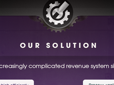
Pubgears
Bryan Cinman
Follow
Following
Like
#3C2444
#472D52
#423D3D
#EEEAEB
#A8A3A6
#807483
Download color palette
landing
landing page
logo
purple
View all tags
Posted on Apr 8, 2012
494
1
9
5
View feedback
Bryan Cinman
More by Bryan Cinman
View profile
Previous
Next
Loading…