


Graphicsdiva Logo

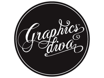
Logo for Graphicsdiva — new personal identity
I always have such an easier time designing for everyone else, but myself. Thus, this one was actually more of a personal challenge, as I kept tinkering and scrapping sketches constantly. I knew I wanted a custom typographic wordmark that would represent "graphicsdiva" but with a very specific tone, message and personality.
The nature of "graphicsdiva" is to embody confidence and pride—versus arrogance or pompous tone, so it was important for the final identity to be bold and strong, yet understated and approachable.
I was interested in the script direction which evokes a soft, feminine and sophisticated, classic feeling—but yet reversing it out on heavier black gives it a slightly darker and edgier intensity. Keeping the wordmark all together on one elongated line was an odd fit for the space and most applications—so I ended up splitting the name into two lines. The extra terminal of the "a" allows for a nice underline of the "diva" to help subtly reinforce that element of the brand.
(I am additionally creating these as stamps for printed collateral.)
All types of feedback highly appreciated!
Thanks!


