UNTDPXLWRKRS

Untdpxlwrkrs_workers_dribbble

1 Attachment

9 Responses

  1. Pro Jay Fanelli Jay Fanelli

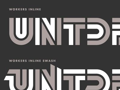
    What started as a t-shirt design turned into four different fonts. The beginning of "Workers," a typeface based on Aaron Draplin's logo for United Pixelworkers. Regular, Swash, Inline, and Inline Swash in the attachment.

    likes

    about 1 year ago

  2. Mike Arney Mike Arney

    Looking good. It definitely lends itself to the inline versions. The regular version honestly isn't doing much for me. Since it's obviously a display face, why not just stick with the inline versions? Maybe the regular version could be optimized for 16-20 pt for subheads?

    about 1 year ago

  3. Pro Michael Spitz Michael Spitz

    Liking where this is going Jay.

    about 1 year ago

  4. Pro Matt Braun Matt Braun

    That's pretty ball'n man. Took me a minute to get the S on the solid ver. tho and I am not sure I would of got it out of context. Maybe something like this would be more legible or as an alternate: http://cl.ly/0T1J2E0J451r3H220P2i

    likes

    about 1 year ago

  5. Pro Jay Fanelli Jay Fanelli

    @Matt Braun Yeah, the S is a problem. The B/E/F are gonna be problems too. Not enough vertical space to fit everything in.

    about 1 year ago

  6. Matt Griffin Matt Griffin

    Tough.

    about 1 year ago

  7. Pro Marshall Bock Marshall Bock

    This is awesome, Jay! Maybe the S would be less problematic if it were upside-down so the curve is on the bottom? (It looks better when I test it by tilting my head, at least ;)

    about 1 year ago

  8. Pro Joel Reid Joel Reid

    I agree about the "S", but apart from that, would love to have the Inline.

    about 1 year ago

  9. about 1 year ago

keyboard shortcuts: previous shot next shot L or F like