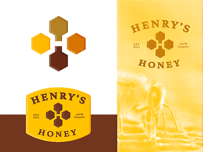
Henry's Honey - Logo Design


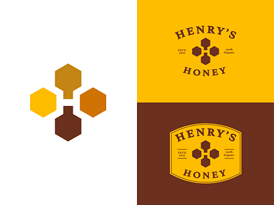
‘Henry’s Honey’ is a premium British company that pride themselves on producing luxury, organic honey; it’s the best quality stuff on the market today.
I felt like a more clean approach was also nice to explore.
This identity work is part of a digital exercise on @Briefbox⚡️
I’m super stoked to have joined The Briefbox as a mentor. I’ll be helping young designers improve their design skills and interact more with the community.
Can you spot all the hidden elements in this design? 🧐
Take a look (or participate) at this project brief here:
https://briefbox.me/briefs/henrys-honey-label/