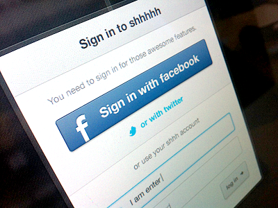
I've literrally spent 20h on that damn login popup... Such a small element, but so important at the same time. Any feedback to make this better is welcome :)
For all the picture haters out there, here is a full snap
Thx a lot to Zulal for the really usefull feedback and patiente!