The Back Yard

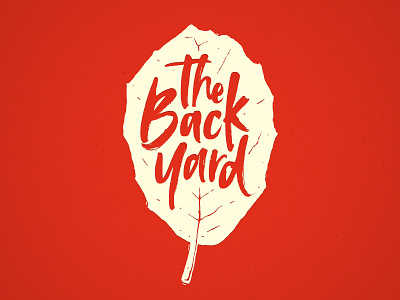
Working on a logo for a gathering of guys who meet monthly in the backyard of the house of one of the hosts. The event is called, creatively, "The Back Yard". I was asked to put together a logo that could be used on card, koozies, etc. I drew inspiration from beer can illustrations and local Austin design trends. I used an oak leaf to communicate the outdoor/nature side of the event as well as to signify "growth", as this group is as much about hanging out with good food and drink as it is building a support community.
I was able to leverage this excellent font from Creative Market (because my handwriting is atrocious) and I drew the leaf on my iPad Pro and vectorized it. I'm quite a novice when it comes to this kind of style and getting those distress lines and details just right was starting to drive me insane. I need to stop messing with it.
I'd love constructive feedback on this style, how to distress it just right, have I added too much detail, too little?


