Find designers
Designer search
Quickly find your next designer
Post a job
The #1 job board for design talent
Inspiration
Courses
UX Diploma
Learn UX design from scratch in 6 months
UI Certificate
12-week UI skill building for designers
Live interactive workshops
with design professionals
Jobs
Go Pro
Log in
Dribbble: the community for graphic design
Advance your career with a Professional Diploma in UX Design
Learn more
Log in
Sign up
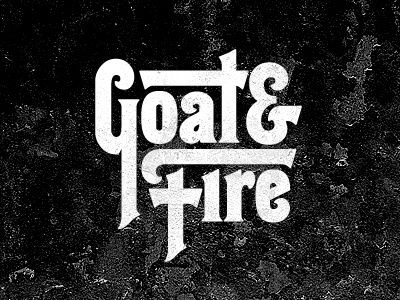
Goat+Fire
Brandon Rike
Follow
Following
Like
#0B0B0B
#F5F5F5
#565656
#9A9A9A
Download color palette
Logo for SiriusXM radio program.
http://soundcloud.com/goatandfire
70s
hessian
lettering
logo
radio
siriusxm
typography
vintage
View all tags
Posted on Apr 5, 2012
3,927
8
111
12
View feedback
Brandon Rike
Art Direction & Design for The Music Industry
More by Brandon Rike
View profile
Previous
Next
Loading…