Find designers
Designer search
Quickly find your next designer
Post a job
The #1 job board for design talent
Inspiration
Courses
UX Diploma
Learn UX design from scratch in 6 months
UI Certificate
12-week UI skill building for designers
Live interactive workshops
with design professionals
Jobs
Go Pro
Log in
Dribbble: the community for graphic design
Log in
Sign up
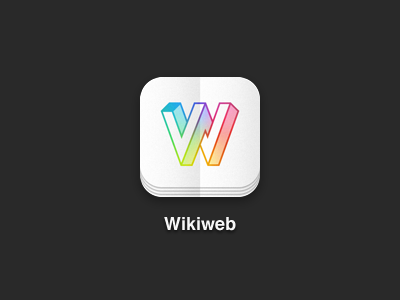
Wikiweb Icon
Andy Mangold
Follow
Following
Like
#292929
#F2F2F2
#C6BABE
#5E5D5E
#E3E099
#3DB9CB
#BF5E70
#D2BE3D
Download color palette
Redone from scratch tonight. Feeling a lot better about it. I promise it's almost ready to ship.
Rebound of
Wikiweb Logo
By
Andy Mangold
app
icon
ios
wikipedia
wikiweb
View all tags
Posted on Apr 3, 2012
5,160
30
208
16
View feedback
Andy Mangold
More by Andy Mangold
View profile
Previous
Next
Loading…