Find designers
Designer search
Quickly find your next designer
Post a job
The #1 job board for design talent
Inspiration
Courses
UX Diploma
Learn UX design from scratch in 6 months
UI Certificate
12-week UI skill building for designers
Live interactive workshops
with design professionals
Jobs
Go Pro
Log in
Dribbble: the community for graphic design
Advance your career with a Professional Diploma in UX Design
Learn more
Log in
Sign up
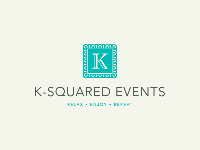
K Squared Events
Sean O'Grady
Available for work
Follow
Following
Like
Get in touch
#A1A69E
#F4F5EB
#02B9B5
#59615A
#A9E2DA
#70D4CE
Download color palette
Proposed logo & identity for a Canada based a la Carte Wedding and Event Consultants.
branding
cream
events
identity
k
k squared
logo
pattern
teal
turquoise
View all tags
Posted on Apr 2, 2012
2,108
4
35
11
View feedback
Sean O'Grady
Logo & Brand Designer. Where Ideas Shape Identity.
Get in touch
More by Sean O'Grady
View profile
Previous
Next
Loading…
Loading…
Loading…