Evernote Color System


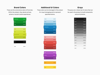

As part of our brand refresh, Evernote’s Product Design team had the opportunity to rethink and consolidate the colors we were using within our product. I was fortunate enough to have been able to lead some of these efforts and set new foundations for our design system.
With that, here are some lessons we learned along the way:
👉The amount of time any individual can spend perusing through different color values is unbounded…which made this a dangerously fun project.
👉Making color decisions are difficult because colors are subjective. As such, it was important for us to establish principles to guide the conversation. For example, we used accessibility standards to push for a more inclusive product and for more intentionality.
👉Our system will continue to evolve, as we learn more about the impact of our decisions. We haven’t nailed everything down perfectly, and that’s okay. We’re excited to continue working on this.
-----
Christine's post on Evernote for Web:
https://dribbble.com/shots/4959992-Evernote-For-Web
Behind the scenes of the brand refresh:
https://medium.com/taking-note/ever-better-refreshing-the-evernote-brand-f3f28ff12a88"


