Find designers
Designer search
Quickly find your next designer
Post a job
The #1 job board for design talent
Inspiration
Courses
UX Diploma
Learn UX design from scratch in 6 months
UI Certificate
12-week UI skill building for designers
Live interactive workshops
with design professionals
Jobs
Go Pro
Log in
Dribbble: the community for graphic design
Log in
Sign up
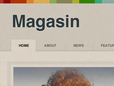
Magasin
Simon Collison
Follow
Following
Like
#C6BEB2
#DAD1C4
#9C9D9D
#4C4B47
#96563A
#878C69
#BEC0BD
Download color palette
Messing with some ideas for a forthcoming theme.
pixel patterns
stripes
textures
View all tags
Posted on Aug 26, 2010
6,664
3
140
22
View feedback
Simon Collison
More by Simon Collison
View profile
Previous
Next
Loading…