Prometheus UI Font

Dribblle_prometheus_font

3 Responses

  1. Max Daunarovich Max Daunarovich

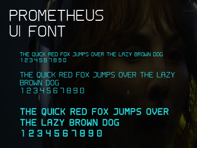
    Recently I was "dissecting" those parts of Prometheus interface which can be seen now in trailers/teasers. I was trying to recreate some of the elements and was lacking the font they are using.
    After short "investigation" I discovered that font consists of quite simple glyphs. And so "I accepted the challenge"! :)
    Here's what I currently have. Upper case letters, numbers and some punctuation symbols - .,::[]()
    It's my very first font I even created and I quite happy with result so far.
    Though setting up kerning and spacing kills me ^__^

    Comparing words typed with fresh backed font with screegrabs I found that some of the letters are using wrong radius on edges and maybe they should be a bit wider. Also font doesn't work properly at most of the small font sizes. Though looks good at 10px and 13px size.
    Definetly need to work more on this one :)

    about 1 year ago

  2. This is reproduction of part of David's interface from "Prometheus".
    You can see original interface, for example, here:
    http://forums.unfiction.com/forums/viewtopic.php?mode=attach&id=27442

    I made this one to test that font I made. Works quite good :)
    I really like how interface and font is similar to each other. They are using the same radius for curves as they have in font and all that stuff really works together :)

    Most of the elements you can see on screen is quite useless for viewer. Interface is intentionally dimmed, so you can pick only valuable parts of it. Digging deeper...

    about 1 year ago

  3. Jason Rozet Jason Rozet

    This is really awesome! I hope you eventually make it downloadable :)

    likes

    12 months ago

keyboard shortcuts: previous shot next shot L or F like