Like this style and standard layout. Heads up. I've run into questionable criticisms of similar designs. "How does the UI allow the user to switch from year to year". I say questionable for 2 reasons. 1. This is an annual calendar. So why? 2. The design I proposed in the past was similar to this and launched from a form field. The user could type in any value for the year. So...
4 Responses
UPDATE: Here is the updated version based on the feedback of @Haziq Mir: http://goo.gl/O01ow
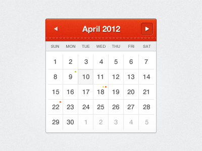
Just a simple little calendar. You might be seeing this as a freebie in the future. Feedback appreciated.
about 1 year ago
Orange can go down a tad in saturation. The spacing on numbers seems a bit odd. Might be just me.
6.5/10 :P
From now on, this is how I will provide feedback.
about 1 year ago
Like this style and standard layout. Heads up. I've run into questionable criticisms of similar designs. "How does the UI allow the user to switch from year to year". I say questionable for 2 reasons. 1. This is an annual calendar. So why? 2. The design I proposed in the past was similar to this and launched from a form field. The user could type in any value for the year. So...
about 1 year ago
@Russell Ryan
Thanks for the feedback! I'll take that into consideration.
about 1 year ago