So clean and soft. I think the upper block with the price might look better if you use the same shadow style as on block with comments. Great work anyway!
@Ivo Ruijters did you know that red converts much higher than other button colors? Red isn't always anger, error, etc. In this context you'd be hard put to convince someone it did. It has more to do with context :)
@Callum Chapman that's what the name is for. In any transaction the buyer can post publicly or anonymously. If you're a seller you always show your profile which includes a pic (if there is one), and your name, and some basic info like your verifications, and any info you've put in your profile. Keeps the community more transparent.
@Icojam I'd thought of the same shadow, but it adds to much contrast.
Looks nice. The different color strokes on the two main modules is slightly weird. That "Cancel" text, is it necessary, or should it be moved to the left of "Send Message." Also, maybe add placeholder text for the input fields.
I'm curious as to why you chose to order the buttons in the way you did. My gut would have been to put "Choose Offer" before "Not Interested. It would be great to hear your reasoning as I'm tackling a similar design challenge.
@Matt D. Smith The strokes? I think you mean the white modules. I answered that above. re: cancel, its placed because of the state/interaction before this one, same with the default placeholder. This is the second state :)
@kyle I've attached a larger view showing different interactions. FWIW, the closed input on the seller view is an alternative interaction not something that is unique to the seller.
I put the weight on the right because I feel like 1) the visual weight of the red button belongs at either right most or left most, not in the middle. 2) Reading left to right I feel that finish actions are best positioned at right when appropriate and "cancel" "not interested" and other secondary actions are best positioned left or first and lower in the hierarchy. If I were positioning these vertically it might be different.
Matthew, as always, killer stuff. my only "complaint" is the odd placement of the date/time of the responses. They don't even look centered, if that was what you were going for. My eyes have to jump from the avatars to the right and then back left to read the responses. Doesn't flow well for me. my personal preference would be to position the date/time flush left with the text within the speech bubbles. that way one's eyes can flow straight down.
20 Responses
Pro
Matthew Smith
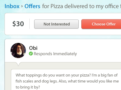
This crap is hard to get right.
about 1 year ago
Pro
Dave Ruiz
Language!
about 1 year ago
Pro
Rogie
Sexy buttons. Smooth stuff. Purty colors.
about 1 year ago
Pro
Jeremiah Adkins
That 'Send Message' button is really calling my name!
about 1 year ago
Pro
Matt Hamm
Lovely work. Quick question; if Yoda didn't have an Avatar, how would you know that it was he who commented.
about 1 year ago
Pro
Ivo Ruijters
This is how it should be done.
One small thing: I personally wouldn't use red for the buttons
(red = aaaarrgh, errors! Problems!)
about 1 year ago
Pro
Micah Sivitz
Love the notches
about 1 year ago
Pro
Joshua Sortino
That red-orange button gets me every time!
about 1 year ago
Pro
Joshua Krohn
Interesting to see the Choose Offer button 2px taller than the Not Interested button.
about 1 year ago
Pro
Callum Chapman
Looking good! What happens if the user doesn't have an avatar though? You wouldn't know who it is?
about 1 year ago
it's awesome how he says it's hard to get right.
and yet this is fucking awesome.
Mad props yo.
about 1 year ago
Pro
Icojam
So clean and soft. I think the upper block with the price might look better if you use the same shadow style as on block with comments. Great work anyway!
about 1 year ago
Pro
Matthew Smith
@Ivo Ruijters did you know that red converts much higher than other button colors? Red isn't always anger, error, etc. In this context you'd be hard put to convince someone it did. It has more to do with context :)
@Joshua Krohn subtle emphasis.
@Callum Chapman that's what the name is for. In any transaction the buyer can post publicly or anonymously. If you're a seller you always show your profile which includes a pic (if there is one), and your name, and some basic info like your verifications, and any info you've put in your profile. Keeps the community more transparent.
@Icojam I'd thought of the same shadow, but it adds to much contrast.
about 1 year ago
Pro
Matt D. Smith
Looks nice. The different color strokes on the two main modules is slightly weird. That "Cancel" text, is it necessary, or should it be moved to the left of "Send Message." Also, maybe add placeholder text for the input fields.
¡Muy bueno!
about 1 year ago
I'm curious as to why you chose to order the buttons in the way you did. My gut would have been to put "Choose Offer" before "Not Interested. It would be great to hear your reasoning as I'm tackling a similar design challenge.
Thanks! :)
about 1 year ago
Pro
Matthew Smith
@Matt D. Smith The strokes? I think you mean the white modules. I answered that above. re: cancel, its placed because of the state/interaction before this one, same with the default placeholder. This is the second state :)
about 1 year ago
Pro
Matthew Smith
@kyle I've attached a larger view showing different interactions. FWIW, the closed input on the seller view is an alternative interaction not something that is unique to the seller.
I put the weight on the right because I feel like 1) the visual weight of the red button belongs at either right most or left most, not in the middle. 2) Reading left to right I feel that finish actions are best positioned at right when appropriate and "cancel" "not interested" and other secondary actions are best positioned left or first and lower in the hierarchy. If I were positioning these vertically it might be different.
about 1 year ago
Pro
Matthew Smith
@all I just realized I had "obi" next to Yoda's name, silly error. The names are next to the avatar whether they are blank or filled.
about 1 year ago
Pro
Matt D. Smith
Yeah the 1px stroke on the white modules. Actually now, 6 days later I like the difference. =)
about 1 year ago
Pro
Paul Jobson
Matthew, as always, killer stuff. my only "complaint" is the odd placement of the date/time of the responses. They don't even look centered, if that was what you were going for. My eyes have to jump from the avatars to the right and then back left to read the responses. Doesn't flow well for me. my personal preference would be to position the date/time flush left with the text within the speech bubbles. that way one's eyes can flow straight down.
thoughts?
about 1 year ago