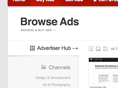
Some work for a redesign of buysellads. Can't really fit enough into this shot, luckily there are some larger shots.