Find designers
Designer search
Quickly find your next designer
Post a job
The #1 job board for design talent
Inspiration
Courses
UX Diploma
Learn UX design from scratch in 6 months
UI Certificate
12-week UI skill building for designers
Live interactive workshops
with design professionals
Jobs
Go Pro
Log in
Dribbble: the community for graphic design
Advance your career with a Professional Diploma in UX Design
Learn more
Log in
Sign up
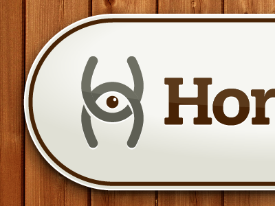
Horseview Logo
Mark Gilliland
Follow
Following
Like
#EEEEE7
#9E5727
#562B0D
#B3AB9E
#696050
#2D1206
#B48962
Download color palette
What do you make of this?
brown
eye
horseshoe
icon
logo
wood
View all tags
Posted on Mar 28, 2012
647
0
7
6
View feedback
Mark Gilliland
More by Mark Gilliland
View profile
Previous
Next
Loading…