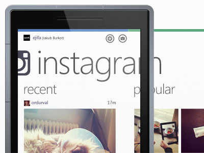
Instagram WP7 Concept

Insta-dribbble

1 Attachment

14 Responses

  1. Sarper Erel Sarper Erel

    See the bigger version in the attachment ( :

    I utterly love instagram and wanted to play around with WP7 UI a bit and this came out. I may go ahead and build a few more screens of the app.

    I have absolutely nothing to do with Instagram team and so. This is just a conceptual work. All images are instagram shots of my dear friends.

    about 1 year ago

  2. Jakub Burkot Jakub Burkot

    Totally dig it Sarp. Finish up a few screens and you have an awesome piece for your portfolio :)

    likes

    about 1 year ago

  3. Joakim Keussen Joakim Keussen

    Looks great, Sarp!
    I'm not too familiar with WP7 so I'm confused about a few things, like the Instagram logo + headline seems to be too wide for the screen etc.

    likes

    about 1 year ago

  4. Corey Ginnivan Corey Ginnivan

    This is awesome man! Hopefully one day it will get picked up by Instragram and created :P

    @Joakim Keussen The app is constructed to be a panaoramic app, so the heading/logo is bigger to let you know there is more content if you swipe across. Its just part of the metro design principles outlined by Microsoft :)

    likes

    about 1 year ago

  5. Ondrej Lechan Ondrej Lechan

    The best look of Instagram so far :) I love color bars on the top, and whole WP7 Metro look

    likes

    about 1 year ago

  6. Sarper Erel Sarper Erel

    @Joakim Keussen it's really interesting you said this because when I showed this to another graphic designer friend of mine, who is not into digital, he gave exact the same response. Like Corey clarified. This is just Metro design principles by MS, I don't judge too much. Once you get used to, it looks pretty neat ;)

    about 1 year ago

  7. noidentity noidentity

    I like it a lot, the color bar on top is very cool.
    I just think the button to actually take a photo should be more visible/prominent.

    likes

    about 1 year ago

  8. Ian Goode Ian Goode

    I like the design, it follows the Metro style well, but it seems almost TOO Metro and not enough of the personality of Instagram. How strict are Microsoft's design guidelines? It's not a platform I'm familiar with...

    about 1 year ago

  9. Sarper Erel Sarper Erel

    Layoutwise you can only stick to a few pre-defined options and I don't think you can use any other font but Segoe WP. Everything else (?) is open. It sounds very boring but the transition animations are pretty good. ( :

    about 1 year ago

  10. Tim Van Damme Tim Van Damme

    Really nice!

    likes

    about 1 year ago

  11. Sarper Erel Sarper Erel

    @Tim Van Damme thanks a lot! ( :

    about 1 year ago

  12. Mads E. U. Sorensen Mads E. U. Sorensen

    @Sarper Erel How do I actually get the Segoe WP font? I have used the UI font for some things, but cant really find the WP one.

    about 1 year ago

  13. Next days I'll upload more screens about this.

    I'm just playing with metro principles. I don't work at Instagram neither Facebook :)

    about 1 year ago

  14. Frank Frank

    @Sarper Erel Any chance you could share the PSD? I'm working on designing some WP 7 Apps but I cant get the layout right or anything. I come from the iOS stand point and designing is quite a change. Great work on it all. Looks marvelous!

    about 1 year ago

keyboard shortcuts: previous shot next shot L or F like