Keep Living

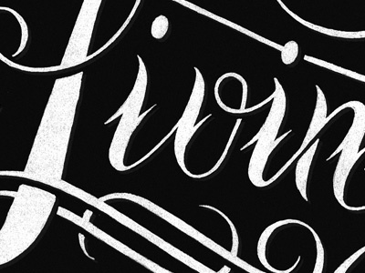
My latest creation for the Phraseology project! All hand drawn with a little bit of photoshop for color and texture. Check out the final as well as the process photos on the Phraseology Project website.
My latest creation for the Phraseology project! All hand drawn with a little bit of photoshop for color and texture. Check out the final as well as the process photos on the Phraseology Project website.


