Find designers
Designer search
Quickly find your next designer
Post a job
The #1 job board for design talent
Inspiration
Courses
UX Diploma
Learn UX design from scratch in 6 months
UI Certificate
12-week UI skill building for designers
Live interactive workshops
with design professionals
Jobs
Go Pro
Log in
Dribbble: the community for graphic design
Log in
Sign up
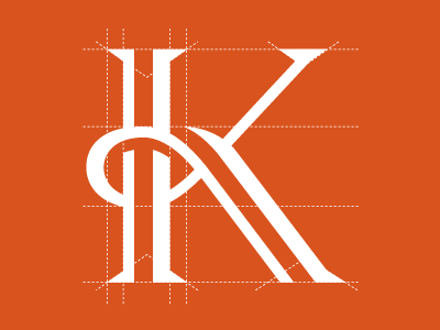
Kallaway grid.
Roy Smith
Available for work
Follow
Following
Like
Get in touch
#D9531E
#FEFDFC
#F3C9B9
#E2794F
#EDAF96
#E7926F
Download color palette
Mark for a 30-year established PR and Sponsorship company in London.
identity
k
logo
pr
typography
View all tags
Posted on Aug 23, 2010
10,434
30
177
32
View feedback
Roy Smith
Simplicity is memorable.
Get in touch
More by Roy Smith
View profile
Previous
Next
Loading…
Loading…
Loading…