Here's a full shot of the send money transaction for this "secret" banking app which I've been working on. This is an early concept, I haven't landed the full project yet, but hoping they like the concept so far.
It uses a slide navigation for the main tasks, so you can navigate between banking options without too much clutter.
As always, thoughts and opinions are most welcome. Throw me a follow on twitter too!
23 Responses
Pro
Zane David
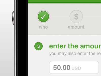
A little sneak peak of a banking app I'm working on. I can't share much on this project yet, but I'm enjoy it a lot so far :)
I sometimes hang around on twitter too.
about 1 year ago
Pro
Kartik Mahant
super fresh like a swiss morning @Zane David
about 1 year ago
Pro
Lukas Bugla
Hey Zane, looks good. The only thing is that the check icon looks a little bit too filigree to me.
about 1 year ago
Pro
Zane David
@Lukas I'm not sure what you mean.
about 1 year ago
not a clue what he means!
about 1 year ago
Pro
Lukas Bugla
Zane, I mean the check Icon on then green button (done / who). I would make it thicker :) More clear?
about 1 year ago
Pro
Zane David
@Lukas Bugla Ah! I see what you are saying now. Thanks for the tip, I do agree!
about 1 year ago
I'd use it! :)
about 1 year ago
Pro
Zane David
@Adam Safar It's hard to tell from this little sneak peak, but I can't wait to show more! Damn NDAs :P
about 1 year ago
Slick. Nice color palette.
about 1 year ago
Pro
Charles Riccardi
Looks pretty great thus far, @Zane David. The green colour is great, and I also like the personality that the checkmark has.
about 1 year ago
https://www.simple.com/ ? :D
about 1 year ago
Pro
Zane David
@Nico Prat Cross that one off the list :P
about 1 year ago
Pro
Callum Chapman
Very nice Zane. Looks like you're gonna be the next Dribbble Superstar!
about 1 year ago
Pro
Zane David
@Callum Too kind mate, I'm just happy creating pixels :)
about 1 year ago
That looks so great, easy on the eye. I also love how subtle the texture is, and especially the warmth of the lower region :)
about 1 year ago
Pro
Zane David
@Manuel Thanks so much :) I really wish I could show more to give the complete feel. Screens will be coming soon though!
about 1 year ago
@Zane David Crap!
about 1 year ago
Wish my Banking app looked this good!
Should the 2 green circles be aligned? (Just judging by the layout here since I can't see a full shot.)
about 1 year ago
Pro
Zane David
@Brentley Broughton Thanks :) hopefully I can show you a full shot in the next few days.
The alignment is tricky, the larger button needs the spacing but it does look a bit weird here. It seems to work on the full shot though :)
about 1 year ago
Pro
Zane David
@Nico Prat You can always tell them to hire me! Would be happy to do an app for them haha
about 1 year ago
@Zane David Maybe I would first ask for myself ;P
about 1 year ago
Rebound
Banking App
by Zane David
Here's a full shot of the send money transaction for this "secret" banking app which I've been working on. This is an early concept, I haven't landed the full project yet, but hoping they like the concept so far.
It uses a slide navigation for the main tasks, so you can navigate between banking options without too much clutter.
As always, thoughts and opinions are most welcome. Throw me a follow on twitter too!
about 1 year ago